I’ve always liked Pedro Bells Funkadelic covers and although this isn’t necessarily his greatest design, what I love about this is the fact that I was still finding new details and jokes on it for years after I got it (and as its my all time fave LP I have spent a long time staring at it).
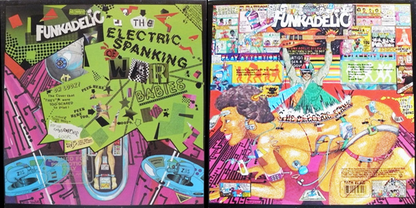
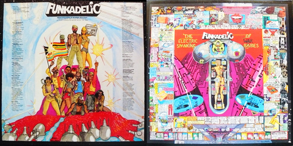
Amazing
Parliament Mothership Connection is a wicked sleeve as well
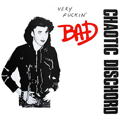
I always saw these two as connected, although by different artists.
Glad to have the thick US original card sleeves.
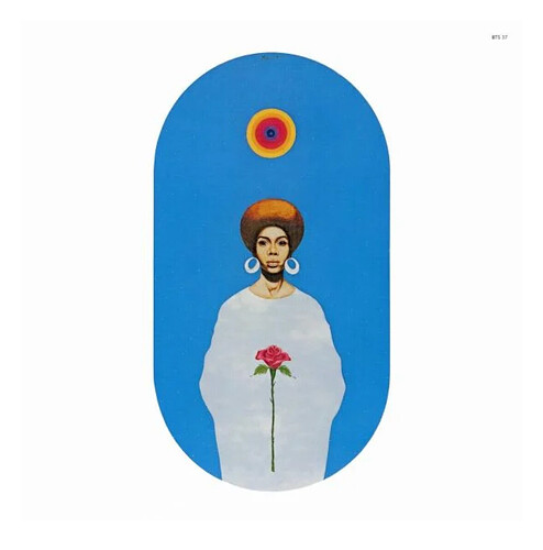
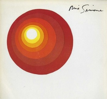
Nina Simone “Here comes the sun”
Luis Gasca “For those who chant”
a record store i used to work at has a (long-dormant) blog showcasing this type of design/typography: http://www.projectthirtythree.com/
Lovely! Thanks ![]()
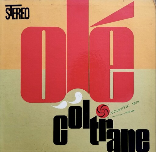
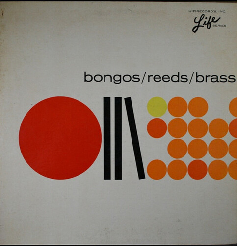
There are so many of these wonderful 1950’s and 60’s typography design covers that this thread would never end. Reid Miles was the king IMO but there are other fantastic designers of the time who did amazing work - crazy to think they did it all by hand.
